

Evenly
Evenly
A learning management software for K-12 education, Evenly (previously EduMinds) classifies children based on their learning styles, retention capacity, and grasping power and then adapts the course content to suit each child. By creating a personalised path for every student, it makes learning inclusive and fair.
The initial ask was the design of a fitting visual identity as the company prepared for a nationwide launch. However, we felt that the brand name at the time, “EduMinds”, felt generic and dated, and had limited storytelling potential. It signalled what the product did, but offered little in terms of emotion, metaphor, or brand personality. So, we asked for the scope to be extended to include a naming exercise.
The brand needed a name that wasn’t so sterile; that didn’t signal function or category and stop there. Instead it carried more story, soul, and standout potential.
Traditional text-based pedagogy in schools turns out to be an unnecessary mountain to climb for children who display an affinity for a different learning style – visual, auditory or kinesthetic. This needs to change. Just because a learner’s way of understanding the world is ‘different’, they should not have to struggle or feel excluded from the system.
Every type of learner should get an equal chance to make the most out of their learning journey. “Evenly”, as a name, embodies this sentiment.
The product is powered by AI-driven learner analytics, data-rich assessments, and algorithmic personalisation. But it’s built for humans. Its visual identity, thus, had to combine intelligence with empathy.
Sounds simple. But, lean too far into “tech,” and risk alienating those who want reassurance and warmth. Over-index on “education as empathy,” and risks looking like just another pastel, feel-good startup.
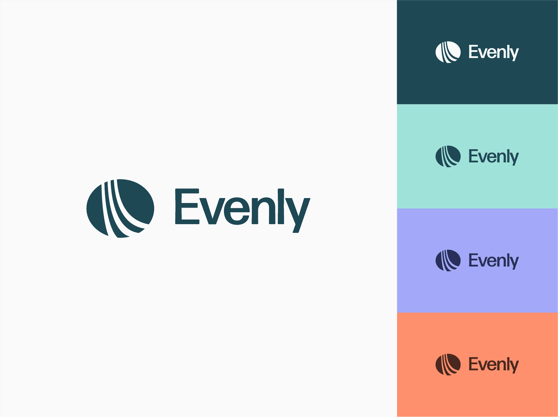
Our logomark shows three curved tracks – three different paths (style) of learning – gradually straightening as they go. Evenly smoothens and accelerates the learning trajectory of every child, regardless of how he/she learns. The tracks are contained in an ellipse-like shape eliciting feelings of warmth and security, crucial to inspire confidence in a child.
Forma DJR Display is our pick for the logotype. While its relatively wide letters complement the shape and emotional payout of our logomark, its clean lines add a tech-like precision.
The brand colours have been chosen keeping in mind longer screen times expected during coursework, tests and evaluations. A cool, deep green and off-white form the primary palette. Their maturity is offset by the warm green, purple and orange, to be used as accents.
A learning management software for K-12 education, Evenly (previously EduMinds) classifies children based on their learning styles, retention capacity, and grasping power and then adapts the course content to suit each child. By creating a personalised path for every student, it makes learning inclusive and fair.
The initial ask was the design of a fitting visual identity as the company prepared for a nationwide launch. However, we felt that the brand name at the time, “EduMinds”, felt generic and dated, and had limited storytelling potential. It signalled what the product did, but offered little in terms of emotion, metaphor, or brand personality. So, we asked for the scope to be extended to include a naming exercise.
The brand needed a name that wasn’t so sterile; that didn’t signal function or category and stop there. Instead it carried more story, soul, and standout potential.
Traditional text-based pedagogy in schools turns out to be an unnecessary mountain to climb for children who display an affinity for a different learning style – visual, auditory or kinesthetic. This needs to change. Just because a learner’s way of understanding the world is ‘different’, they should not have to struggle or feel excluded from the system.
Every type of learner should get an equal chance to make the most out of their learning journey. “Evenly”, as a name, embodies this sentiment.
The product is powered by AI-driven learner analytics, data-rich assessments, and algorithmic personalisation. But it’s built for humans. Its visual identity, thus, had to combine intelligence with empathy.
Sounds simple. But, lean too far into “tech,” and risk alienating those who want reassurance and warmth. Over-index on “education as empathy,” and risks looking like just another pastel, feel-good startup.
Our logomark shows three curved tracks – three different paths (style) of learning – gradually straightening as they go. Evenly smoothens and accelerates the learning trajectory of every child, regardless of how he/she learns. The tracks are contained in an ellipse-like shape eliciting feelings of warmth and security, crucial to inspire confidence in a child.
Forma DJR Display is our pick for the logotype. While its relatively wide letters complement the shape and emotional payout of our logomark, its clean lines add a tech-like precision.
The brand colours have been chosen keeping in mind longer screen times expected during coursework, tests and evaluations. A cool, deep green and off-white form the primary palette. Their maturity is offset by the warm green, purple and orange, to be used as accents.
Services
Services
Naming
Naming
Visual Identity
Visual Identity
Client
Client
Sarvodaya Life Skill Pvt Ltd
Sarvodaya Life Skill Pvt Ltd
Year
Year
2025
2025
Lead
Lead
Akhoury Abhishek
Akhoury Abhishek
Design
Design
Harshit Rao
Harshit Rao
Motion
Motion
Harshit Rao
Harshit Rao
More projects

Naming
/
Visual Identity
Leapsworth
Logo Design
Shark Auditors
Visual Identity
Begin Again
Packaging Design
Reset