


Begin Again
Begin Again
Begin Again is a straight talking, relationship driven sales and marketing partner for real estate developers. They specialise in lead generation, lead management and training, and they are very clear about their way of working. Honest feedback, no fluff, and a focus on outcomes. In workshops they also shared frustration. Large national developers still see them as a small local outfit. The old identity did not project the sharpness and confidence they bring to the work.
So the project started with a simple question. How do we make Begin Again look like the firm they already are in practice, and position them as a credible partner for higher tier developers, without losing their clarity and grit.
The logo is the core of that answer. The main symbol is a trapezoid with a wide base and a pointed, rising corner. It suggests steady upward movement and feels anchored at the same time. Along its top edge, three triangular planes show a clear progression, a visual shorthand for repeated intelligent effort and improvement over time. The wordmark sits in two lines, BEGIN over AGAIN, forming a block that balances the symbol and reads like a firm, confident statement.
Color plays an important role in placing Begin Again in the world of their clients. The logo holds in black and white, which keeps it authoritative and timeless across media. Around it, we introduced a bright yellow as the primary brand color. That yellow is common in engineering and construction, so it instinctively feels at home in the category. On black it carries energy and visibility, and when used in measured amounts it signals expertise and confidence.
Graphics extend directly from the logo. The three planes of the symbol are stretched and cropped into supergraphics on the folder, envelopes and the reverse of the business card. On black backgrounds they appear as subtle tonal shapes or as fine yellow line work, which gives the system a distinctive texture without making it busy.
For type, we leaned into a bold, clean sans serif set in caps for the wordmark and key headings. It mirrors the way the team speaks: direct, organised, and easy to read. Supporting text stays simple and highly legible, suited for documents, letters and long proposals.
Each collateral applies these decisions in a specific context. The business card is a compact piece of theatre: dark, tactile, with the mark and supergraphic creating a strong first impression. The letterhead is restrained so that the content stays primary, yet the logo and information block at the top signal a serious organisation. The envelope and the folder use the yellow lines and enlarged symbol to create impact when a proposal, offer letter or contract is handed over.
Taken together, the system gives Begin Again a visible step up in stature. It presents them as a focused, modern and confident partner, one that looks entirely at home in conversations with the big developers they want to work with, while still reflecting their no nonsense way of doing business.
Services
Services
Visual Identity
Visual Identity
Client
Client
Begin Again Business Solutions LLP
Begin Again Business Solutions LLP
Year
Year
2025
2025
Lead
Lead
Akhoury Abhishek
Akhoury Abhishek
Design
Design
Harshit Rao
Harshit Rao
Motion
Motion
Harshit Rao
Harshit Rao
More projects

Naming
/
Visual Identity
Leapsworth
Logo Design
Shark Auditors
Naming
/
Visual Identity
Evenly
Packaging Design
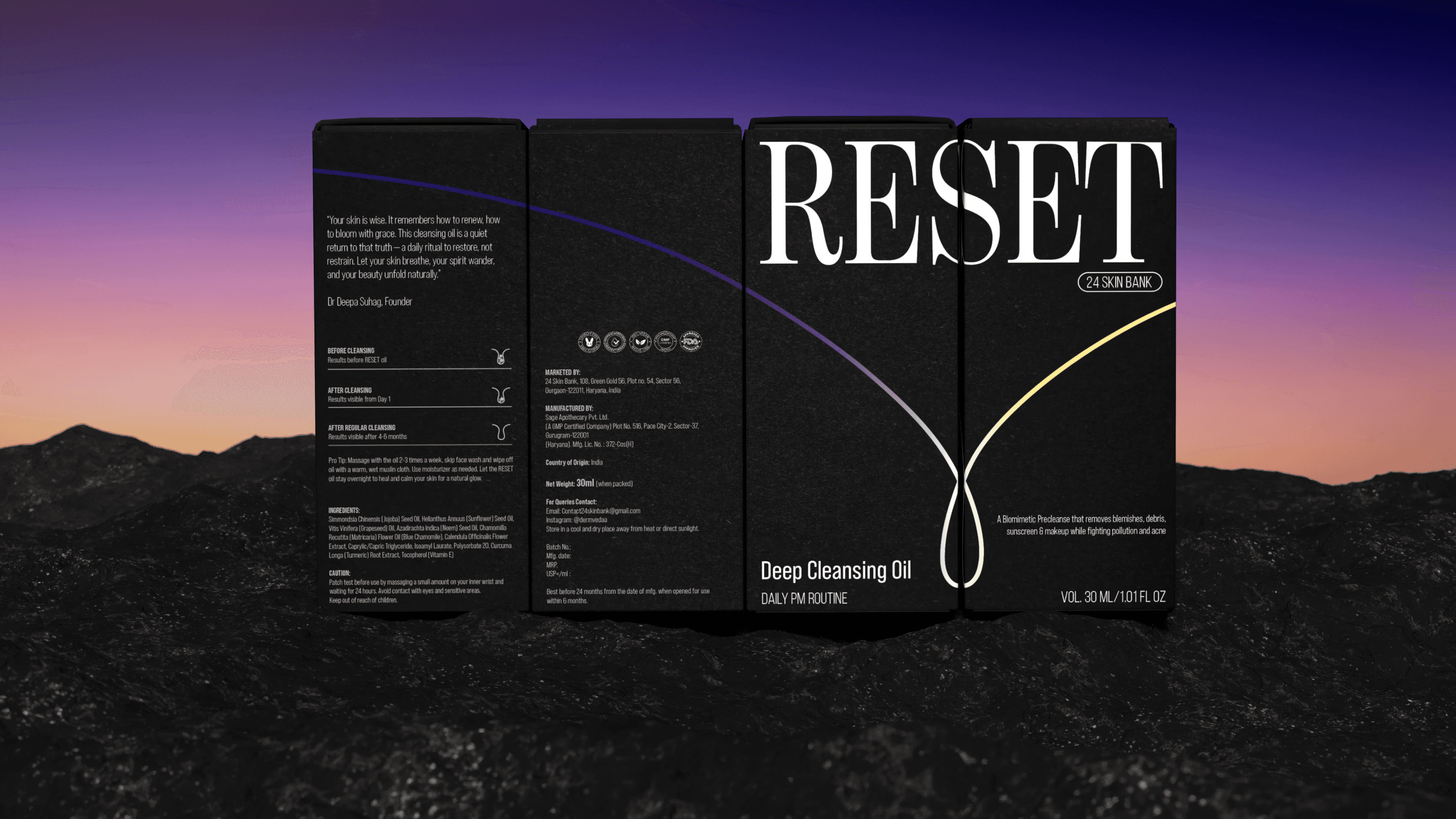
Reset