Shark Auditors
Shark Auditors
Shark Auditors is a chartered accountancy firm with 20+ years of hard-won credibility in tax advisory and accounting. Built through long-term client relationships and consistent outcomes, the firm now sees the next few years as a focused growth phase. The ambition is clear: move up the value chain and become a natural choice for a higher tier of clients, including listed companies, HNIs, and large corporates.
In premium professional services, larger clients rarely evaluate partners only on competence. They look for fit, confidence, and boardroom-ready signals. They notice how a firm shows up visually, how it presents itself, and whether it feels intentional. Shark Auditors had the reputation, but the identity was not reflecting the scale of work it already delivers, and the scale it wants to win next.
So the problem statement became: how do we make Shark Auditors look ready for the next tier, without turning the firm into something it isn’t. The identity needed to balance tradition with ambition, and expertise with energy. It needed to feel sophisticated, global-standard, and at home in the world of its target clients, while still staying understated and professional.
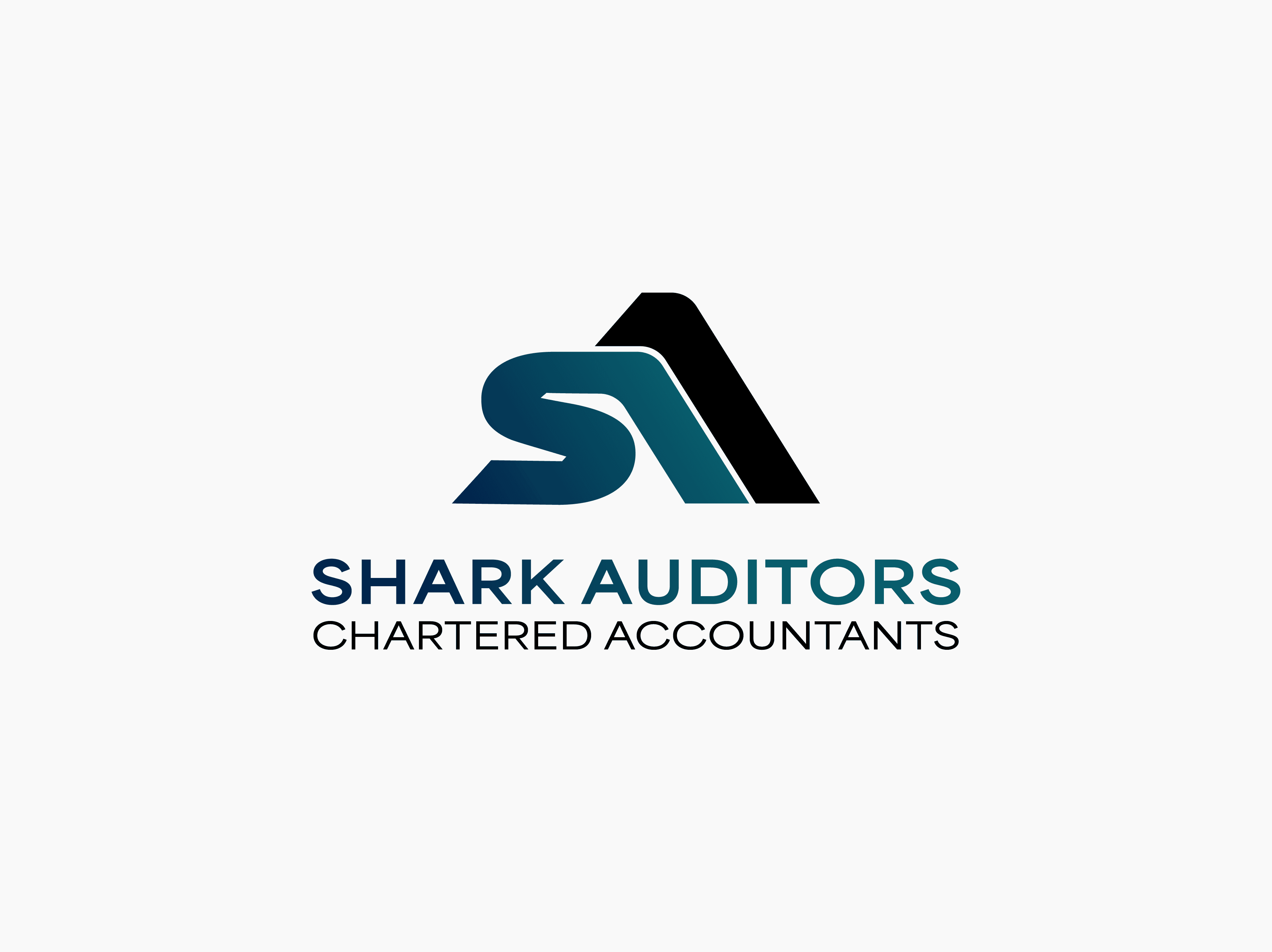
We designed an SA lettermark that locks the firm’s initials into a single, confident form. The ‘S’ is rounded and continuous, signalling steadiness, clarity, and long-term reliability. The ‘A’ is defined by a sharp, upward structure, bringing in a sense of ambition and forward motion. Together, the mark feels like a single unit rather than two letters, which helps the firm look larger and more established across applications.
Deep teal anchors the identity in the world of money. The subtle gradient adds a sense of momentum. Black is used deliberately as an additional signal of seriousness and restraint.
Typography stays clean and structured. A modern sans-serif in uppercase gives the wordmark a corporate, global tone and ensures legibility across digital and print. The hierarchy between “Shark Auditors” and “Chartered Accountants” is clear and functional, which matters in a category where credibility is often communicated through small details and consistent presentation.
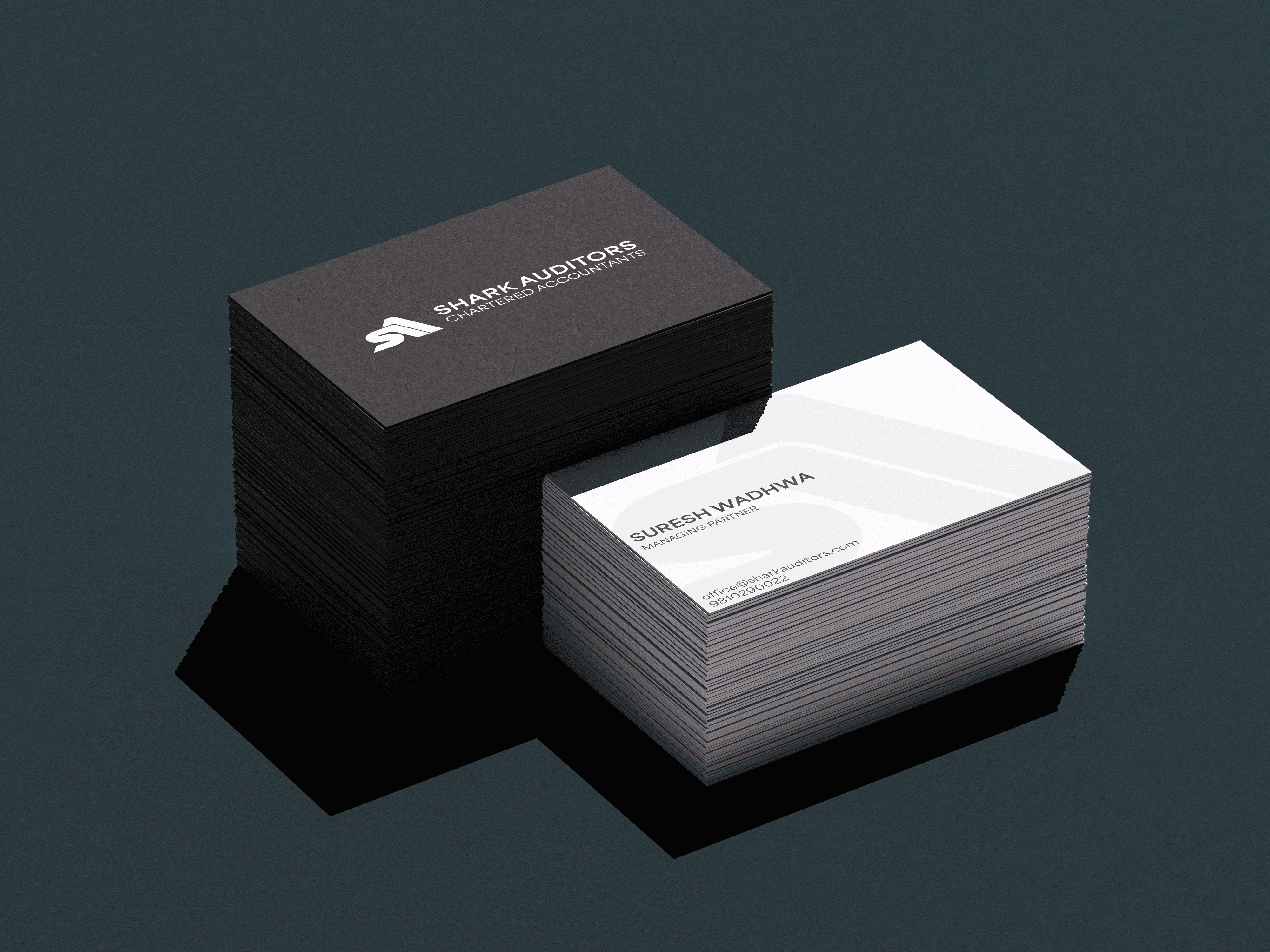
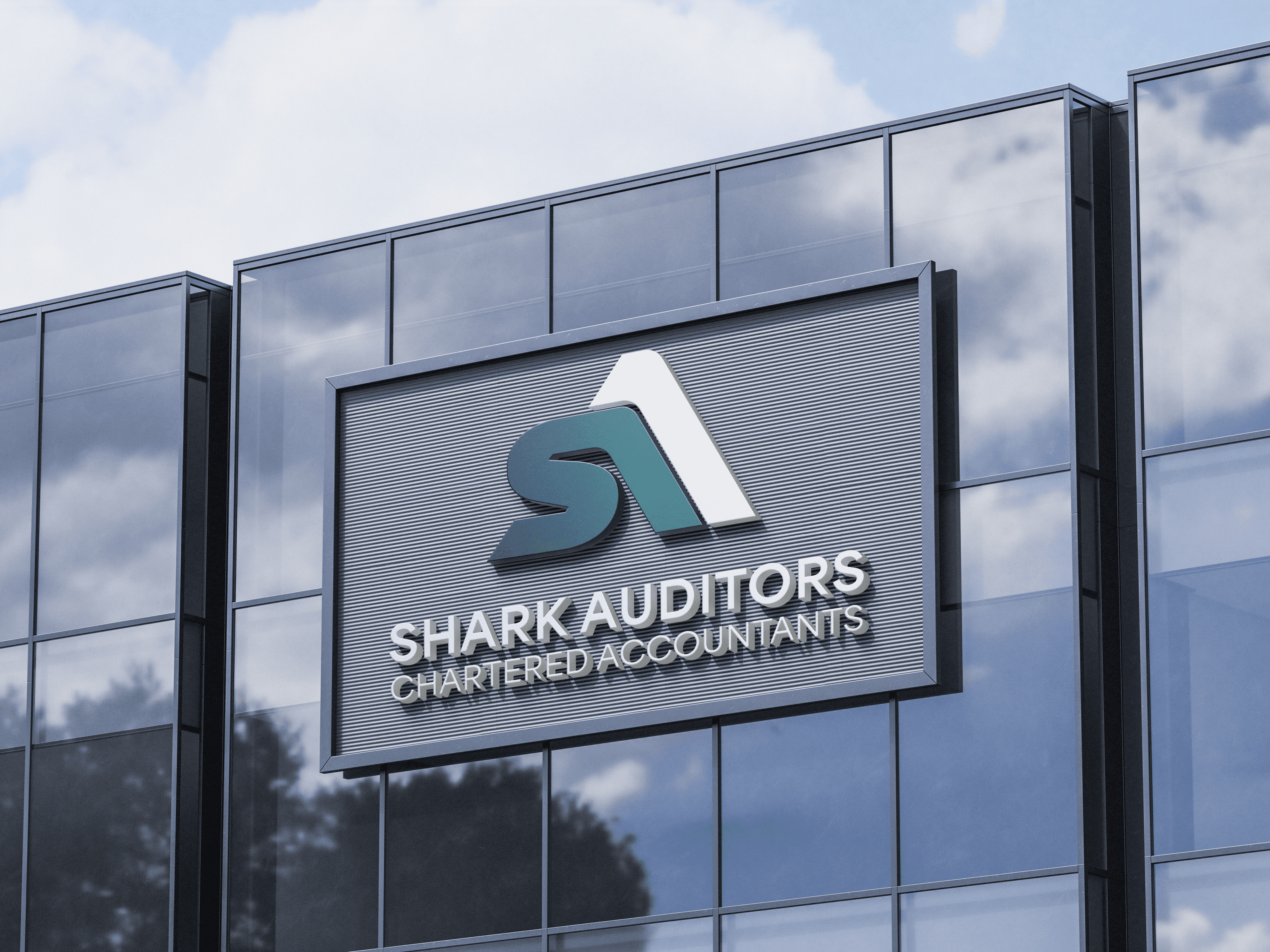
Taken together, the identity is a visible step up in stature. It makes Shark Auditors feel intentional, contemporary, and premium-ready, without losing the grounded trust that the firm has earned over two decades. It helps the firm look like the partner its next-tier clients expect before the first conversation even begins.
Shark Auditors is a chartered accountancy firm with 20+ years of hard-won credibility in tax advisory and accounting. Built through long-term client relationships and consistent outcomes, the firm now sees the next few years as a focused growth phase. The ambition is clear: move up the value chain and become a natural choice for a higher tier of clients, including listed companies, HNIs, and large corporates.
In premium professional services, larger clients rarely evaluate partners only on competence. They look for fit, confidence, and boardroom-ready signals. They notice how a firm shows up visually, how it presents itself, and whether it feels intentional. Shark Auditors had the reputation, but the identity was not reflecting the scale of work it already delivers, and the scale it wants to win next.
So the problem statement became: how do we make Shark Auditors look ready for the next tier, without turning the firm into something it isn’t. The identity needed to balance tradition with ambition, and expertise with energy. It needed to feel sophisticated, global-standard, and at home in the world of its target clients, while still staying understated and professional.
We designed an SA lettermark that locks the firm’s initials into a single, confident form. The ‘S’ is rounded and continuous, signalling steadiness, clarity, and long-term reliability. The ‘A’ is defined by a sharp, upward structure, bringing in a sense of ambition and forward motion. Together, the mark feels like a single unit rather than two letters, which helps the firm look larger and more established across applications.
Deep teal anchors the identity in the world of money. The subtle gradient adds a sense of momentum. Black is used deliberately as an additional signal of seriousness and restraint.
Typography stays clean and structured. A modern sans-serif in uppercase gives the wordmark a corporate, global tone and ensures legibility across digital and print. The hierarchy between “Shark Auditors” and “Chartered Accountants” is clear and functional, which matters in a category where credibility is often communicated through small details and consistent presentation.
Taken together, the identity is a visible step up in stature. It makes Shark Auditors feel intentional, contemporary, and premium-ready, without losing the grounded trust that the firm has earned over two decades. It helps the firm look like the partner its next-tier clients expect before the first conversation even begins.
Services
Services
Logo Design
Logo Design
Client
Client
Shark Auditors Chartered Accountants
Shark Auditors Chartered Accountants
Year
Year
2026
2026
Lead
Lead
Akhoury Abhishek
Akhoury Abhishek
Design
Design
Harshit Rao
Harshit Rao
More projects

Website Design
Wedding Charters

Naming
/
Visual Identity
Leapsworth
Visual Identity
Begin Again
Naming
/
Visual Identity
Evenly
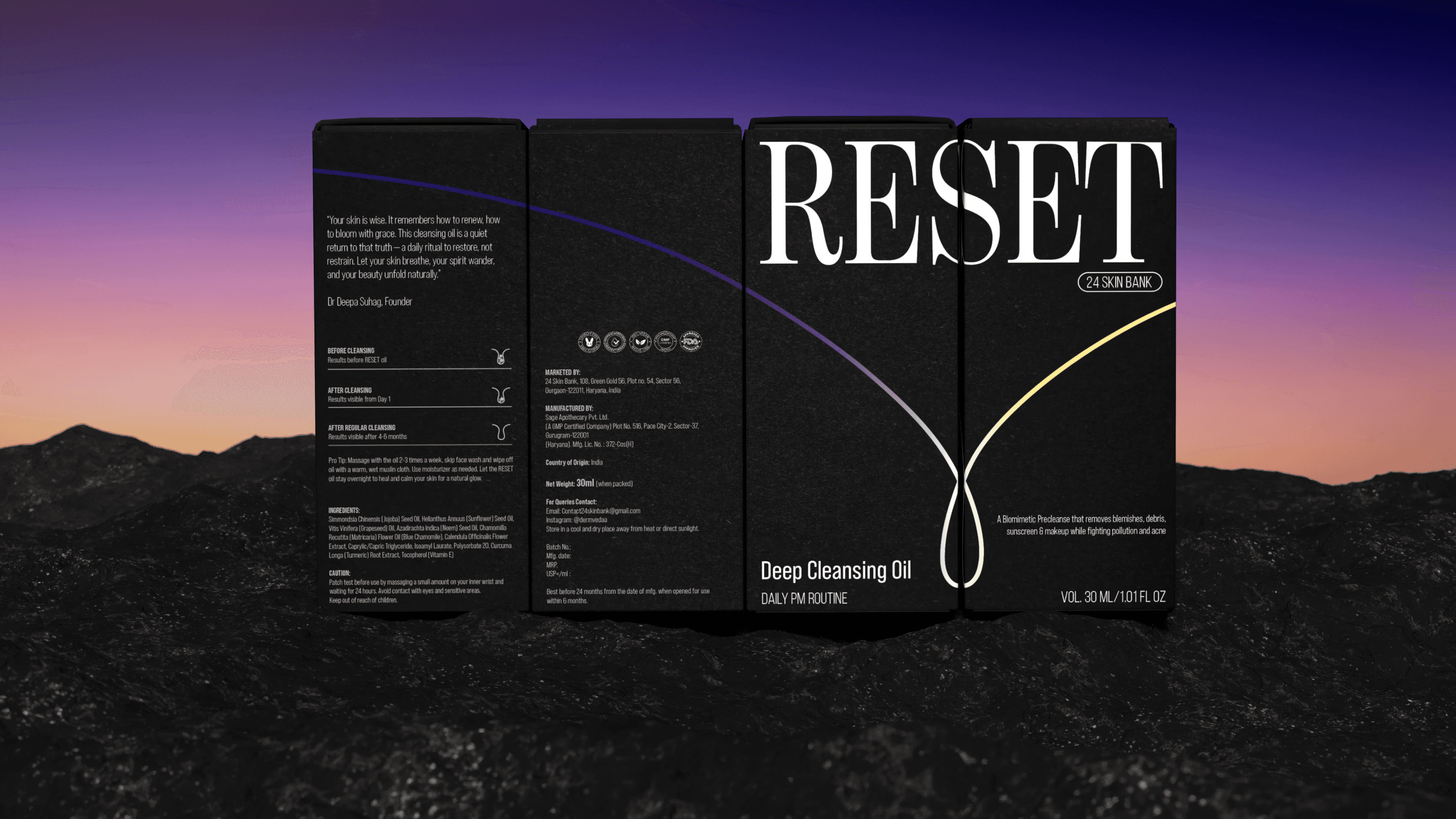
Packaging Design
Reset