
Leapsworth
Leapsworth
Leapsworth is a guidance and recruitment company for students and professionals in the medical sciences who want to study or work abroad. The business was earlier called Vision Abroad, a name that described the broad category but also pulled it into the wrong visual and verbal territory. This is an industry crowded with false promises, opaque processes, and commission-led operators who push whichever university or hospital pays them well. Many of them look and sound closer to travel agencies than serious academic or professional intermediaries. Leapsworth needed to move away from that world altogether.
How do you make such a company feel credible, institution-facing, and trustworthy before a candidate or recruiter has even spoken to it?
The answer began with renaming. Leapsworth was chosen carefully to feel more at home in the world of universities, hospitals, and medical institutions abroad, particularly in Europe. The name carries more structure, more seriousness, and more familiarity than Vision Abroad. That matters in a category like this. To recruiters, it feels easier to place. To candidates, it feels aspirational without sounding loud or salesy. The business immediately gained a different kind of footing.
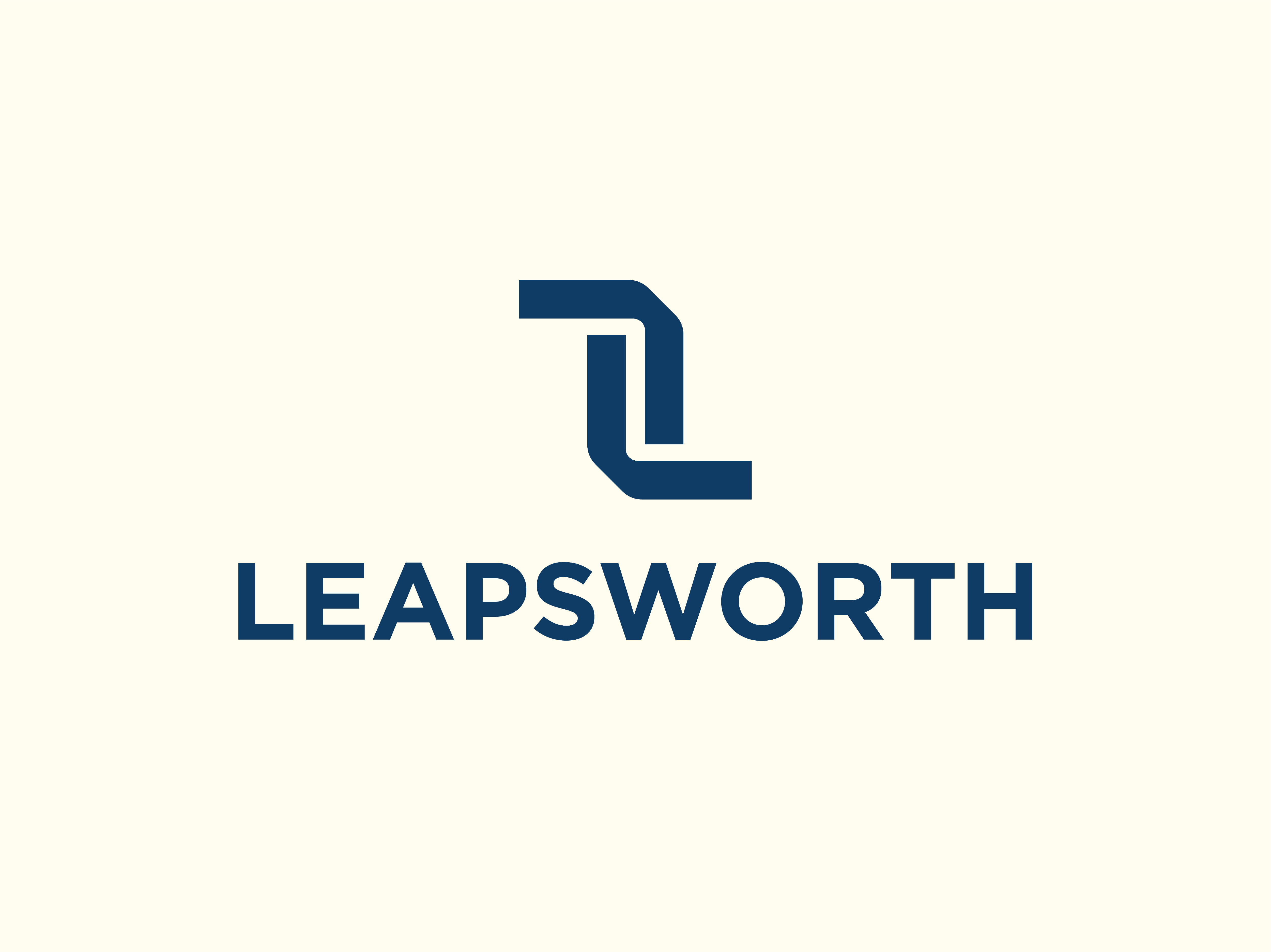
The identity was then built around the same idea. The logo was designed to communicate stature, stability, and seriousness. Its form is compact, controlled, and disciplined. There are no obvious cues borrowed from travel, tourism, or generic abroad consultancies. No planes, no globes, no destination imagery. That restraint was deliberate. Leapsworth had to look like a company that guides consequential academic and career decisions, not one that packages foreign aspiration into a sales pitch.
The wordmark was set in Gotham, which also became the headline typeface for the wider brand system. That choice gave the brand a strong institutional character from the outset. Gotham feels corporate, serious, and stable, which was exactly what the business required. Once extended across presentations, social media, digital touchpoints, and print communication, it helped the brand speak in one firm and coherent voice.
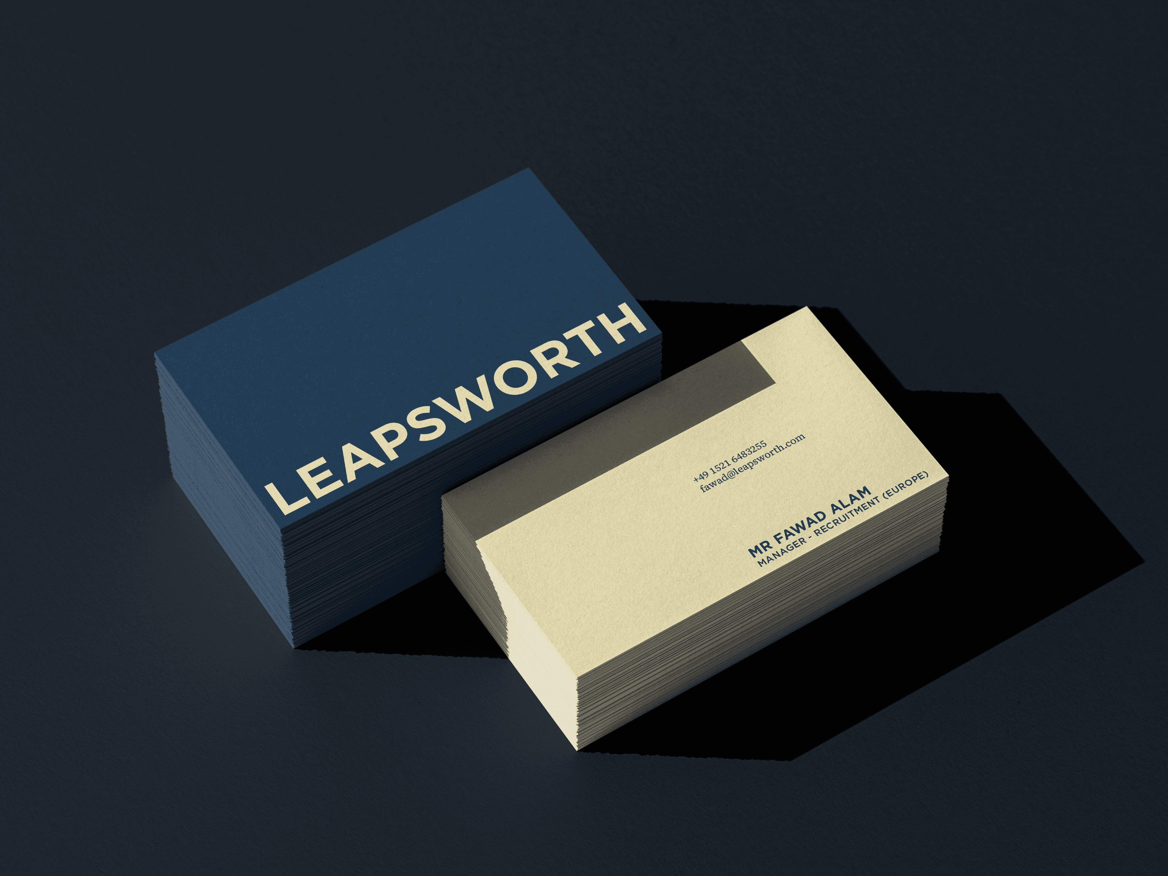
The colour palette followed the same logic. Navy became the primary colour, giving the identity authority and permanence. Light cream became the secondary colour, bringing warmth and calm to the system. For digital use, that cream was made even lighter so screens could be viewed comfortably for extended periods. For print, separate colour specifications preserved the intended depth and softness on paper. Together, the palette helped the brand feel composed and credible, rather than glossy, promotional, or transactional.
A key part of the system came from the logo unit itself. One portion of the mark was extracted and used to create a wider graphic language for the brand. This allowed the identity to expand into frames, crops, dividers, and supporting devices across social media assets, presentations, and image layouts. The result was a visual system with internal logic. Even without the full logo in view, the brand remained recognisable.
To support rollout, extensive brand guidelines were developed across logo usage, typography, digital and print colour behaviour, spacing, hierarchy, graphic devices, image application, and layout principles. For a company that would need to communicate across candidate journeys, institutional material, and content-led platforms, that level of detail was necessary. It gave the brand consistency and made dilution less likely over time.
The image bank was built through a range of AI tools and workflows, but the brief for it was precise. These images could not fall into tourist-friendly visual language. They could not look like destination marketing, travel advertising, or postcard aspiration. Instead, they were shaped around the emotional reality of the candidate journey. The earliest images carry uncertainty and hesitation. The middle stage shifts into cautious optimism. The final stage moves toward confidence, progress, and arrival. That made the visual world more human, and far more relevant to what the company actually does.
The brand video, also generated entirely through custom AI workflows, extended the same thinking into motion. It was designed to evoke hope and add emotional warmth, while still staying grounded in the seriousness of the category. Like the image bank, it avoids tourist cues and outward glamour. Its role was to humanise the brand, not to romanticise relocation.
The final outcome gave the company a sharper and more believable position in the market. The move from Vision Abroad to Leapsworth changed the way the business could be read by candidates, recruiters, universities, and hospitals alike. It now looks like a brand built for trust, structure, and institutional fit, which is exactly what this category demands, and exactly what most of it lacks.
Leapsworth is a guidance and recruitment company for students and professionals in the medical sciences who want to study or work abroad. The business was earlier called Vision Abroad, a name that described the broad category but also pulled it into the wrong visual and verbal territory. This is an industry crowded with false promises, opaque processes, and commission-led operators who push whichever university or hospital pays them well. Many of them look and sound closer to travel agencies than serious academic or professional intermediaries. Leapsworth needed to move away from that world altogether.
How do you make such a company feel credible, institution-facing, and trustworthy before a candidate or recruiter has even spoken to it?
The answer began with renaming. Leapsworth was chosen carefully to feel more at home in the world of universities, hospitals, and medical institutions abroad, particularly in Europe. The name carries more structure, more seriousness, and more familiarity than Vision Abroad. That matters in a category like this. To recruiters, it feels easier to place. To candidates, it feels aspirational without sounding loud or salesy. The business immediately gained a different kind of footing.
The identity was then built around the same idea. The logo was designed to communicate stature, stability, and seriousness. Its form is compact, controlled, and disciplined. There are no obvious cues borrowed from travel, tourism, or generic abroad consultancies. No planes, no globes, no destination imagery. That restraint was deliberate. Leapsworth had to look like a company that guides consequential academic and career decisions, not one that packages foreign aspiration into a sales pitch.
The wordmark was set in Gotham, which also became the headline typeface for the wider brand system. That choice gave the brand a strong institutional character from the outset. Gotham feels corporate, serious, and stable, which was exactly what the business required. Once extended across presentations, social media, digital touchpoints, and print communication, it helped the brand speak in one firm and coherent voice.
The colour palette followed the same logic. Navy became the primary colour, giving the identity authority and permanence. Light cream became the secondary colour, bringing warmth and calm to the system. For digital use, that cream was made even lighter so screens could be viewed comfortably for extended periods. For print, separate colour specifications preserved the intended depth and softness on paper. Together, the palette helped the brand feel composed and credible, rather than glossy, promotional, or transactional.
A key part of the system came from the logo unit itself. One portion of the mark was extracted and used to create a wider graphic language for the brand. This allowed the identity to expand into frames, crops, dividers, and supporting devices across social media assets, presentations, and image layouts. The result was a visual system with internal logic. Even without the full logo in view, the brand remained recognisable.
To support rollout, extensive brand guidelines were developed across logo usage, typography, digital and print colour behaviour, spacing, hierarchy, graphic devices, image application, and layout principles. For a company that would need to communicate across candidate journeys, institutional material, and content-led platforms, that level of detail was necessary. It gave the brand consistency and made dilution less likely over time.
The image bank was built through a range of AI tools and workflows, but the brief for it was precise. These images could not fall into tourist-friendly visual language. They could not look like destination marketing, travel advertising, or postcard aspiration. Instead, they were shaped around the emotional reality of the candidate journey. The earliest images carry uncertainty and hesitation. The middle stage shifts into cautious optimism. The final stage moves toward confidence, progress, and arrival. That made the visual world more human, and far more relevant to what the company actually does.
The brand video, also generated entirely through custom AI workflows, extended the same thinking into motion. It was designed to evoke hope and add emotional warmth, while still staying grounded in the seriousness of the category. Like the image bank, it avoids tourist cues and outward glamour. Its role was to humanise the brand, not to romanticise relocation.
The final outcome gave the company a sharper and more believable position in the market. The move from Vision Abroad to Leapsworth changed the way the business could be read by candidates, recruiters, universities, and hospitals alike. It now looks like a brand built for trust, structure, and institutional fit, which is exactly what this category demands, and exactly what most of it lacks.
Services
Services
Naming
Naming
Visual Identity
Visual Identity
Client
Client
Abazer Consultancy Services Pvt Ltd
Abazer Consultancy Services Pvt Ltd
Year
Year
2026
2026
Lead
Lead
Akhoury Abhishek
Akhoury Abhishek
Design
Design
Jayshree Ramgarhia
Jayshree Ramgarhia
Harshit Rao
Harshit Rao
Motion
Motion
Harshit Rao
Harshit Rao
Gen AI
Gen AI
Harshit Rao
Harshit Rao
Harshit Rao
More projects

Website Design
Wedding Charters
Logo Design
Shark Auditors
Visual Identity
Begin Again
Naming
/
Visual Identity
Evenly
Packaging Design
Reset